If you ever look for “Irony” in the dictionary we believe you should find this picture, as it’s the perfect example of it!
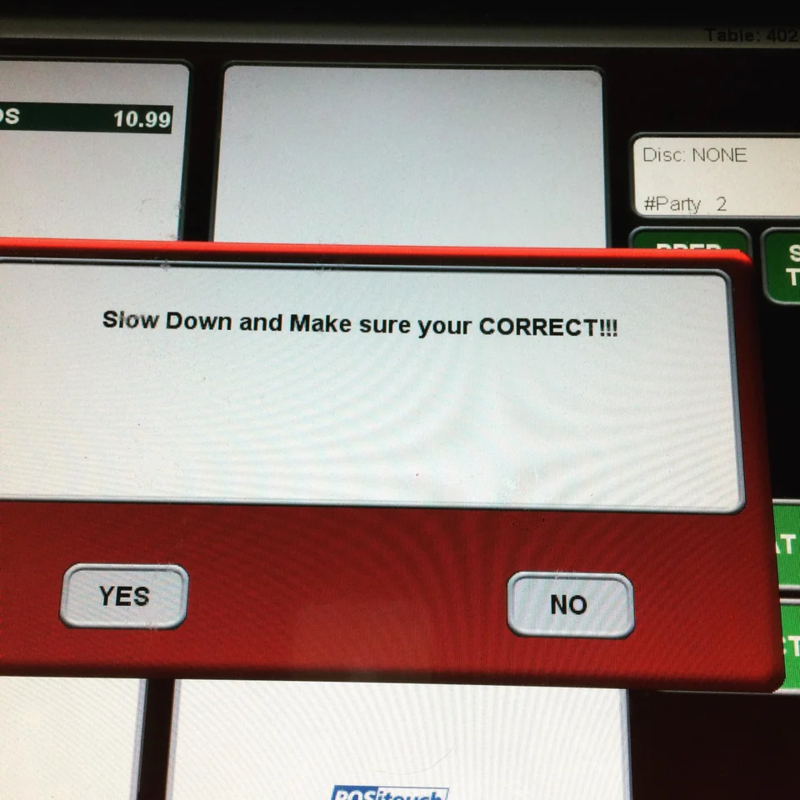
The very same pop-up message telling you to slow down and make sure you’re correct is guilty of one of the ultimate grammar sins: confusing between “your” and “you’re.” Seriously, at this point, everyone should know when to use which one!
Sending a Clear Message
This company decided they should send their customers a clear message, letting them know exactly how much they actually care. By placing the customer suggestion box just above the dust bin they let everyone know where they think suggestions should actually go.
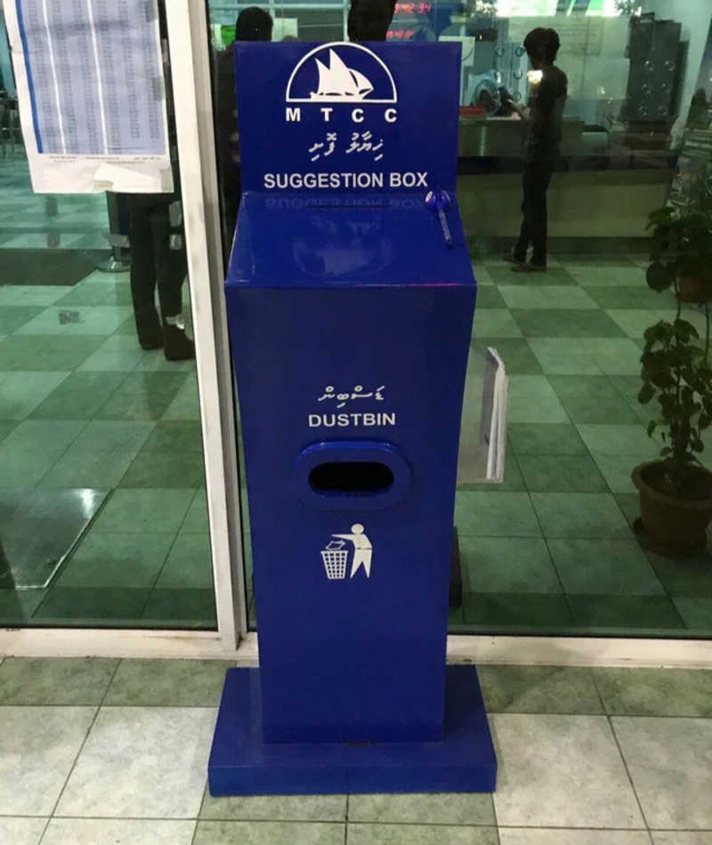
We're not sure if this is just a terrible coincidence or if the suggestions go straight to the garbage but we don't care enough to find out.
I Can't Hear a Thing
While trying to study for a test, one student ran into a problem — his textbook seemed to rely on listening to certain audio files. But, alas, as far as we can tell, paper can't play sound, no matter how hard you try to press the button. No, closing the book and then opening it again doesn't help either.
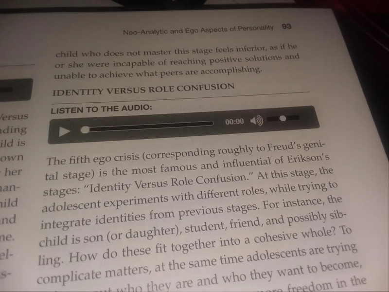
Honestly, with the high cost of college textbooks these days, we would have appreciated it if they at least could have played audio files.
Almost There
Christmas is usually an exciting time in almost every kid's life. We mean, what could be better than waking up to a pile of presents? Technically nothing could, but realistically sometimes Santa gives grandma terrible gift ideas.
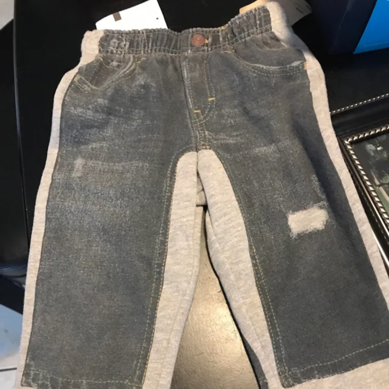
Like that one year when you begged for a new pair of jeans, but all you got were these sweats with a jean design printed on them.
Hotel From Hell
Imagine this scenario: you have chosen to spend the night at a hotel, expecting to enjoy yourself and have a relaxing evening. You step into the shower, which is already isn't as fancy as you wanted it to be. After spending some time in the shower you feel like the room lacks ventilation which is when you look for the venthole.
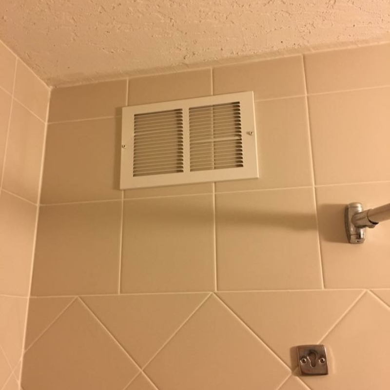
Sadly, you discover a design fail, or maybe a design scam — there's a vent but it's just screwed directly onto the wall. No actual ventilation here!
Zoo Got It Wrong
The Wellington zoo wanted to try and find a fun way to teach children about the environment. They decided to assign each one of their recycling bins a different animal and give each animal a speech bubble asking the children to feed them.
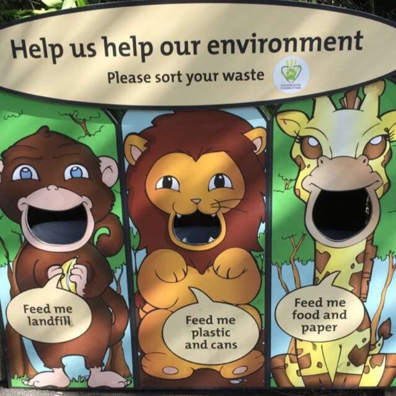
But, we feel like they forgot these are children they are dealing with, and they might come out of the zoo thinking they should actually feed lions plastic. These bins might help the environment but they will probably hurt animals.
Temporary Insanity
One person found that they kept on making what felt like a silly mistake. Every time they wanted salted butter, they found that have grabbed the unslated one and vice versa.
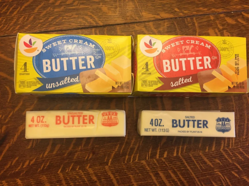
This person was ready to declare themselves insane until they learned it was actually a design fail that has caused all this drama. Turns out that the unsalted butter stick has a red label, but the box has a blue one, and vice versa!
Why Would You Do That?
It seems like this designer was trying to think out of the box, or maybe out of the bottle, and add measurements to help runners know exactly how much water they have drunk.
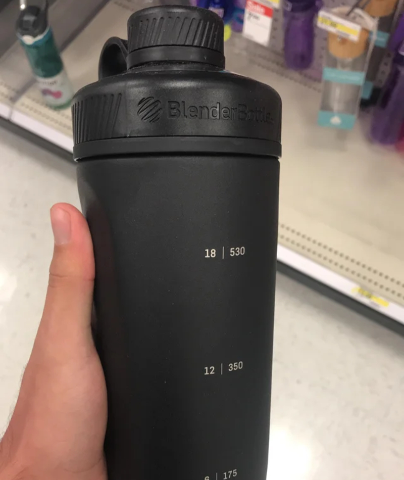
But, we have a feeling this designer was just out of design school and hasn't had enough time to learn the secrets, as well as the obvious truths of the trade. One such truth is that you can't see through a non-transparent bottle.
Lemons Are Orange?
Apparently, when life gives you lemons, you should make orange juice. We've never heard that one before, maybe because it makes zero sense.
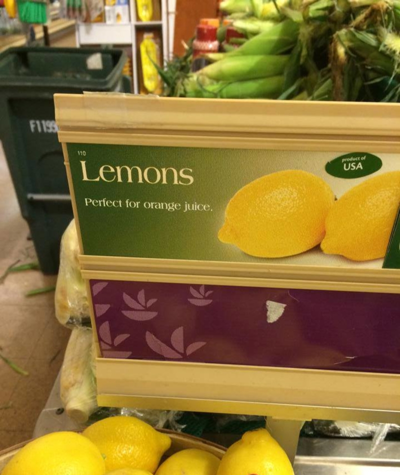
We're not even sure this one is a design fail, maybe it's more of a logical fail. Let us tell you something kids: no matter how many lemons you squeeze together, you will never be able to turn them into orange juice.
Bad Design or Just Bad Art?
While many designs can be bad or baffling, not all designs make it so that the item is completely unusable. But, when your only job was to design a bathroom door, it's important to make sure this door actually protects people's privacy as they are doing their business.
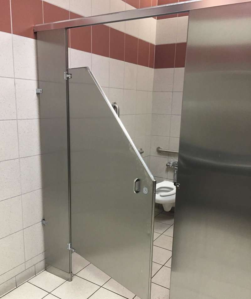
Honestly, we would have loved to have a chat with the person who made this door to try and understand. Maybe it's an artistic statement about the lack of privacy in the digital age?
Hot Mess
We almost want to say we can kind of picture what the designer was trying to go for with this design, but we just can't. Combining two words together using a common letter is only cool if it's down with two different words.
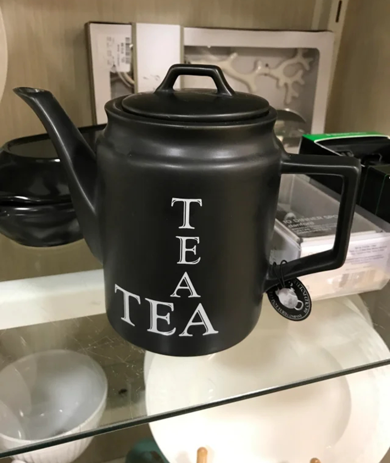
We can't believe we have to spell it out. Also, if that's indeed what this designer was going for, he did a terrible job. From the different font sizes to the fact the letter A appears twice, this teapot is just a hot mess.
Eurrope Is Missing You
If you ask us, this flyer failed long before the word "eurrope" made its way into it. The whole thing smells of mature design, from the white border to the teenagers who all seem as if they were taken out of a stock image.
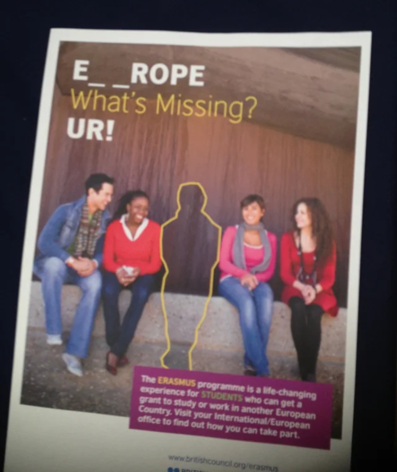
But, the cherry on top is of course the spelling mistake that gave us a whole new continent we can't wait to visit!
Boy Syrup?
Back when we were in school, our grammar teacher kept on telling us that punctuation is very important, but honestly, we didn't believe her.
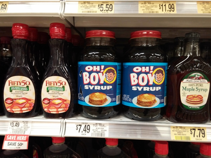
That is until we saw this product. The problematic punctuation has made us think terrible thoughts, like, how many little boys are needed in order to make one bottle of boy syrup? Now we just feel that the person who designed this should have listened more carefully during his school days.
Happy 20170
It's New Year's Eve, and all you want to do is go out and celebrate the new year that's about to come. What's a better way to celebrate than wearing silly glasses to welcome the new year?
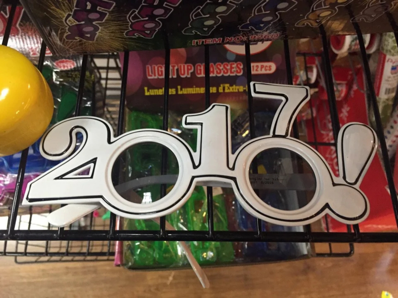
There's just one problem, the person who designed these 2017 glasses couldn't incorporate the year in a way that makes sense. This is why we have these 20170 glasses, which means we're super ready for when that year finally comes.
Stretchy Cat
All this innocent, non-suspecting person wanted was kitten socks. Then, one day, he finally found them and it felt like all of his dreams finally came true. But when it was time to put them on, a terrible design flaw revealed itself. The cat print stretches to form a distorted kitty all across his ankle.
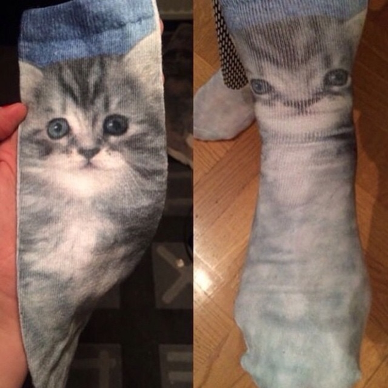
You'd think the person who was in charge of the design would try the socks on, but it doesn't seem like that was the case.
No Silly Walking
We can see that this is some type of warning sign, but it's hard to understand what we're being warned about. Is it that silly walking down the straits might result in serious back injuries?
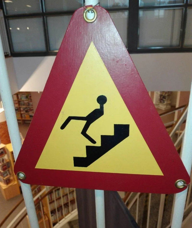
Because the man in the picture doesn't look in good health, not to mention the fact he has no hands. Next time, don't let the kids draw warning signs or this is what you'll end up with.
Just Press Green to Cancel
At first glance, it's just a normal ATM machine, but a simple design fail has probably left many people frustrated with this one. The person who took this picture tells us that he accidentally canceled his transaction twice and didn't understand what was going on.
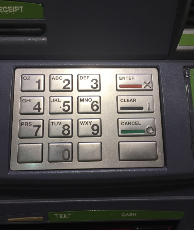
But then, he took a good hard look. It's safe to say that person who designed this was either absent-minded or color-blind.
Leave Him Alone
Maybe technically there's nothing wrong with this design. But if you take the time to think about what you're witnessing, you'll realize there's something a little bit distorted about it.
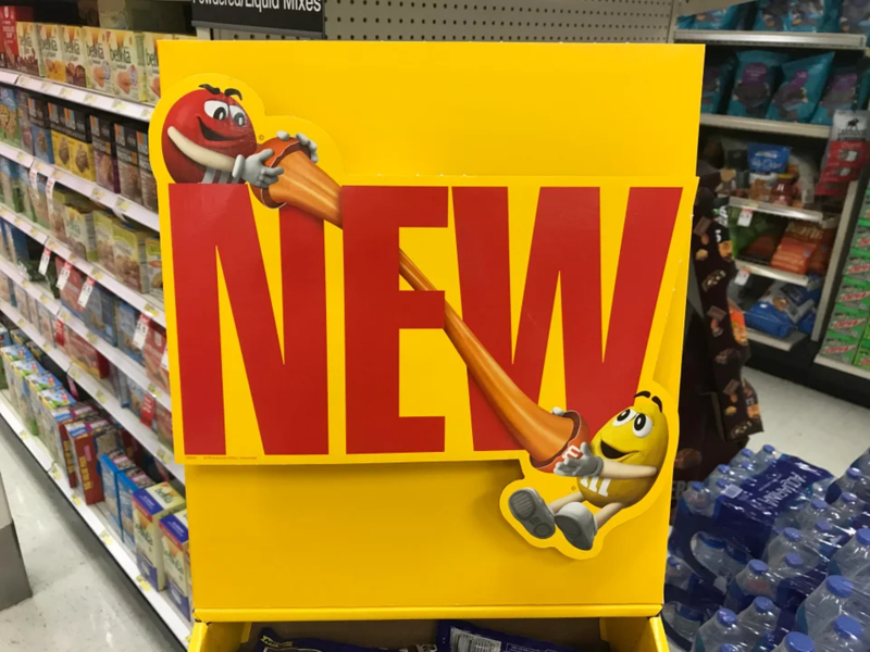
Two M&Ms playing together by taking a third one, breaking it in half, and then stretching it? That's so mean. Leave him alone, what did he ever do to deserve this treatment? Is this what M&M murder looks like?
I Know What You Did
Is that just us or can this clock tell what we had for lunch? How did it know we had meat? Maybe it can't, and this is just a terrible design. Oh, we see, this was meant to be "You had me at hello."
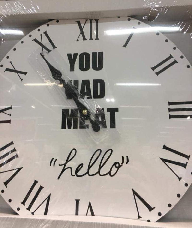
But, alas, when the hands point upwards, the "me" and the "at" combine to create "meat", and with that terrible font, who even notices the "hello" at the bottom? We give this clock designer an F.
What's Your Emergency?
Okay, so first, we have to put it out there, there's just no way the kids these crayons are intended for have ever seen a phone that looks like that.
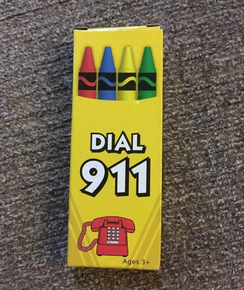
A picture of a cell phone would have made more sense to them. But that's not the only thing that makes no sense here. What would the emergency be? A kid that can't find the red crayon?
Baby Changing Room
Finally! A sign we can very easily read! This bathroom stall is for everyone, men, women, disabled, and women who need to remove their babies' heads. Or maybe, they just need to put it back on? Either way works.
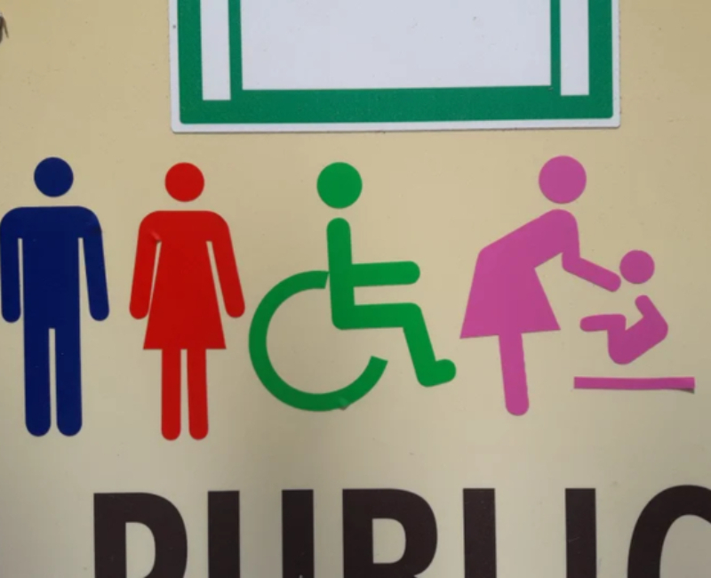
Oh wait, we feel so foolish for not understanding it's a baby changing room. Is that where you can put one baby and get another one instead?
So Many Questions
Who wouldn't want this? A shirt with a picture of someone wearing that same shirt, where do we sign up? Let's say we will wear this shirt, will that mean we'll give birth in July? Will we give birth to the woman on the shirt?

Who thought of this stupid design? And maybe the most burning question of them all is, has anyone ever bought it?
Cup Can't
What do you mean don't put beverages in cup holders? What should we use this cup holder for, if not to hold our drinks?
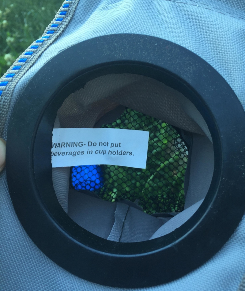
Which warning will come next? Please don't sit on the chair? Or maybe, please don't sleep on the bed? Wait, we have a better one — please don't read this article! Are you still reading? We told you to stop!
You Only Had One Job
They say that the cobbler's children have no shoes, but we've never heard it said that the carpentry can't make itself a new wooden sign! What a disgrace.
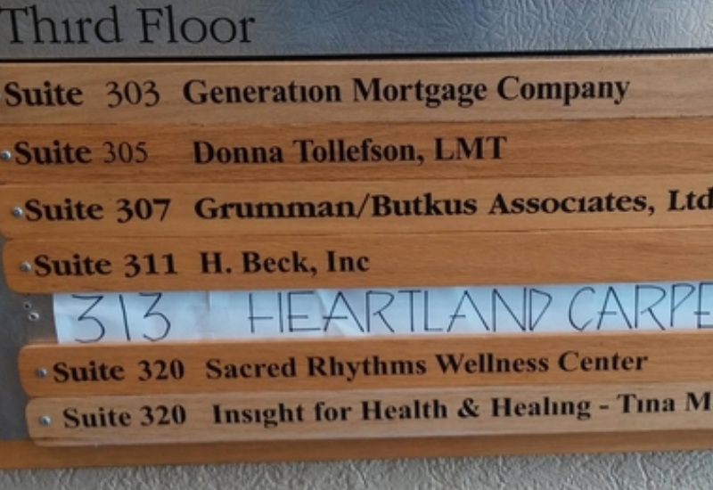
We feel like there's no excuse in this case. They already have the materials and they wouldn't have to pay anyone for the labor. Also, who would trust a carpentry with a paper sign?
Stating the Obvious
This seems like it should have been pretty straightforward. If for some reason, you have a door that floats above the ground, a flight of three stairs should do the trick.

But — and we feel silly for having to say this — you should make sure the flight of stairs you build actually leads to the door and not into the wall...
Where Should I Go?
At first glance, this looks like a solid sign. But, upon further inspection, it becomes clear that this sign might mislead some of us, depending on how we read it.

Is the customer car park to the right, or to the left? It could be either one. Guess you'll just have to make a guess and hope you get it right.
The Definition of Irony
If you ever look for "Irony" in the dictionary we believe you should find this picture, as it's the perfect example of it!

The very same pop-up message telling you to slow down and make sure you're correct is guilty of one of the ultimate grammar sins: confusing between "your" and "you're." Seriously, at this point, everyone should know when to use which one!
An Emergency
Listen, we have an emergency, and it's regarding the emergency plan — it's completely unreadable which makes us feel incredibly unsafe.
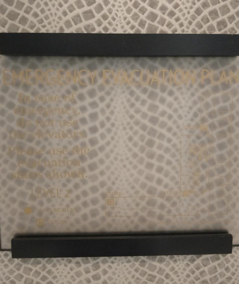
If you can't even read this sign, you're not the only one. How are we supposed to know what to do in case of an emergency? Maybe no one really knew how to create an emergency protocol and management figured this was the best way to pretend they did.
What's in the Box?
Kids are still learning about the world, which means they are a lot more impressionable than us adults. Also, the fact that they are small and don't know much, and we're so big and seem to know more (we know nothing, but don't tell them that) creates some type of rivalry.
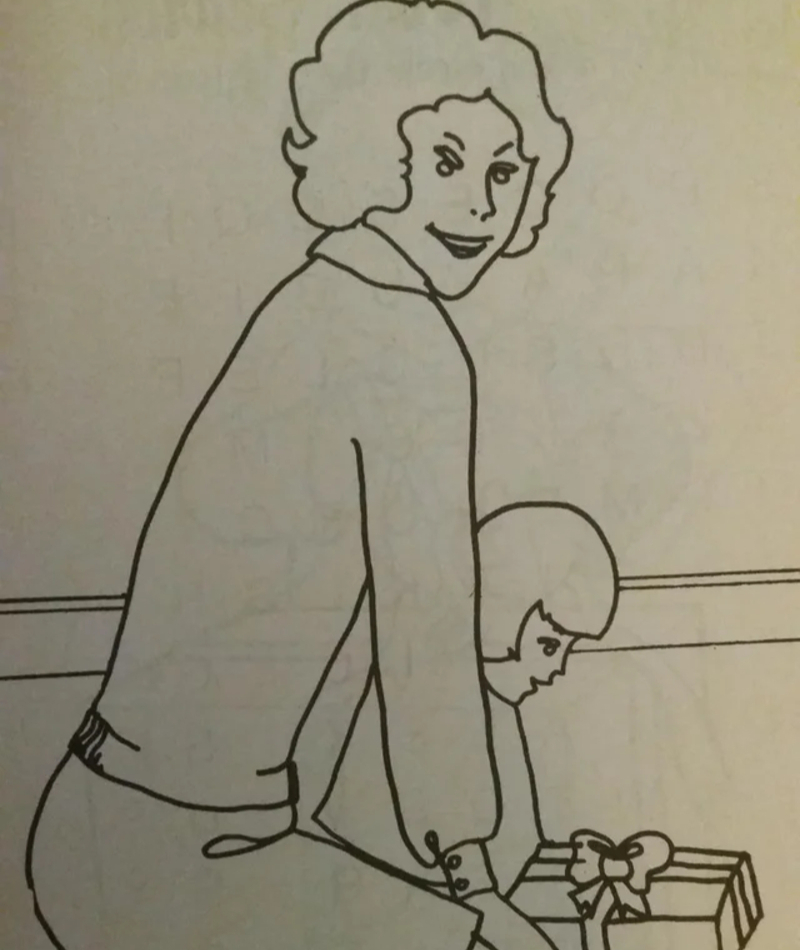
The last thing we need is for some book to present adults as terrible, menacing people. Seriously, who drew this woman and why did they make her so scary?
Spicing It Up
This "not allowed" sign doesn't make a lot of sense to us. Has anyone ever seen a pigeon out in the wild and thought "Looks like it needs some seasoning?" We don't think so.
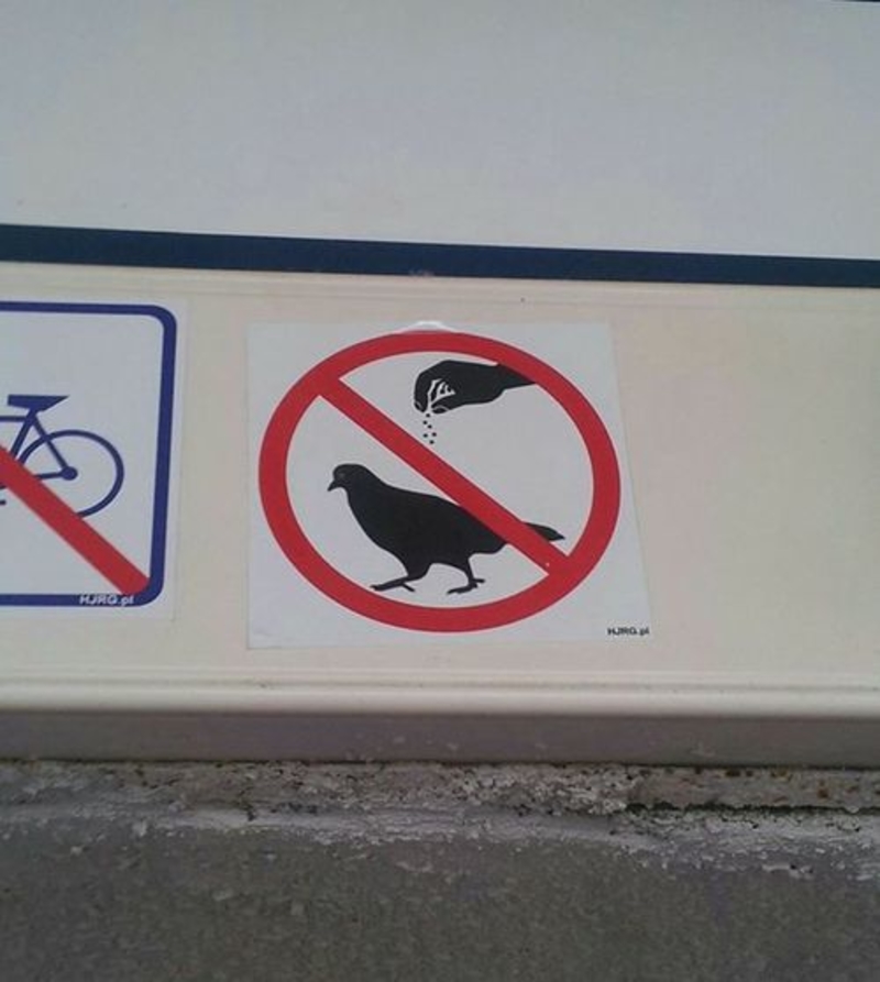
Most pigeons live outside and they have to fend for themselves, so they already have enough on their plate without having random humans seasoning them. If you really want to help pigeons, just feed them, after all, there's no sign telling you not to.
That's a Bit Extrem, Isn't It?
Die for success? Is there really no other way? Because we do enjoy living for the time being. Oh, wait, there's another window, one that tells us that "sel sful living." Now, were totally confused.
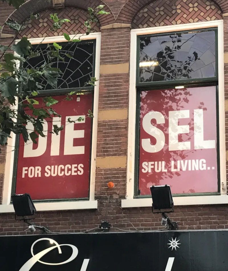
Apparently, this was supposed to be an ad for the clothing brand Diesel. But, some people online claim that this mistake is 100% on purpose, to get people like us talking and thus creating more talk about the brand.
Are You Positive?
Hindsight is 20/20, but in the present, we're almost always blind to something. Sometimes it's genuinely hard to catch why something is wrong until it's way, way too late. Like this mosaic that was created for a hotel named "Henry IV."
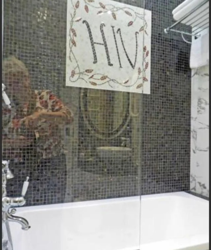
Of course, by the time they realized that they spelled the name of a terrible virus on the wall of the hotel's bathroom, it was way too late to do anything about it. At least we hope it makes guests chuckle.
Ouch!
This must be the worst slide design ever. Either the designer hates children, or they misunderstood the point of a slide. There's just no way anyone could slide on this thing comfortably. Was this someone's school project?
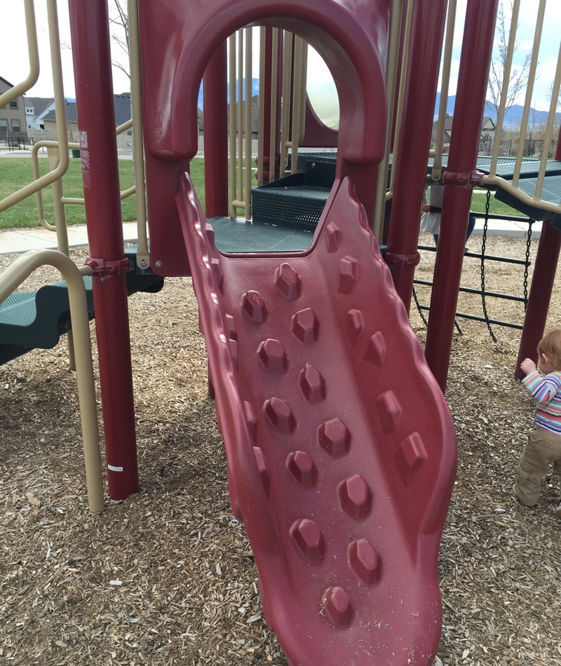
Because if we were this person's design teachers, we would have given them an F. Instead, it seems like this person graduated and was given a job, which just wasn't the right decision if you ask us.
What's a Jeopard?
Maybe we're stating the obvious, but spelling mistakes are never good. Still, it seems that these kinds of mistakes are even worse when it comes to products meant for children. Could you imagine having this puzzle as a kid and thinking that Jeopard is a real thing?
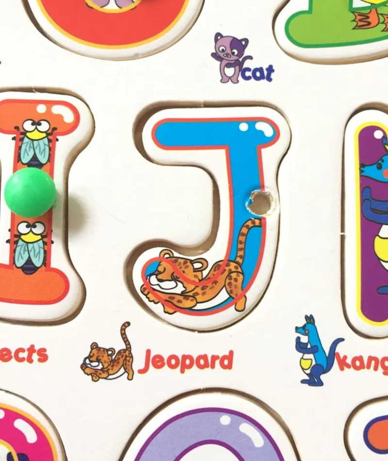
What happens when the kid asks his parents to go see some Jeopards? Gotta break it down to him that just like Santa and the tooth fairy, Jeopards aren't real.
The Wrong Gender
At first glance, there's nothing wrong with this design. It's just a beautiful mural of a man and a woman hiking, drawn on the doors to the bathroom stalls.
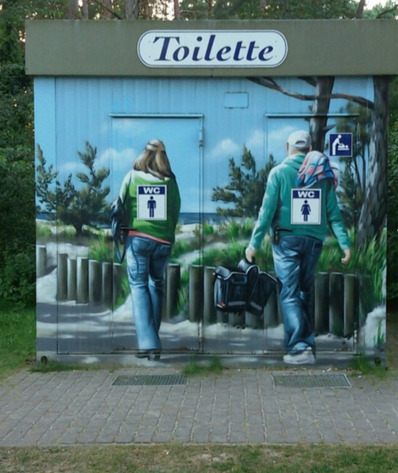
The problem is that usually, the bathroom with the woman on them is, well, the women's bathroom. But, alas, the mural wasn't thought through, and the opposite gender is drawn on each one of the stalls. We bet that has led to some awkward mistakes.
Proofread Please
Maybe, because it's a children's book that barely has any words in it, they thought there was no need to hire someone to proofread it. Or maybe, they did have someone proofread it, but all he did was make sure the number is spelled correctly, missing the fact that there are, in fact, six bananas and not five.
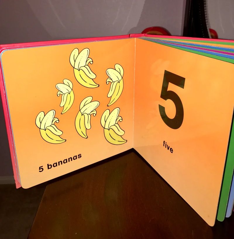
The parents that read this book to thier children probably had a lot of explaining to do.
The Mice Bag
Come on, McDonald's. You've been around long enough to know the importance of proper marketing. Then again, they're truly offering a sweet deal right there. One dollar for 10 pounds of mice? That's a bargain.
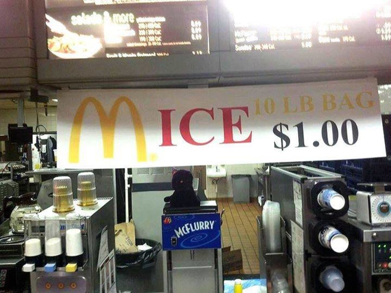
Just the phrase you want to see at your favorite fast food restaurant - "10 lb. bag of mice".
Delicious Cheesecake
To be fair, some of those cheeses do look like perfectly delicious slices of cake. However, when looking over at that almost empty cup of coffee, thinking they used a tray of cheese as the dipping snacks just make us want to vomit.
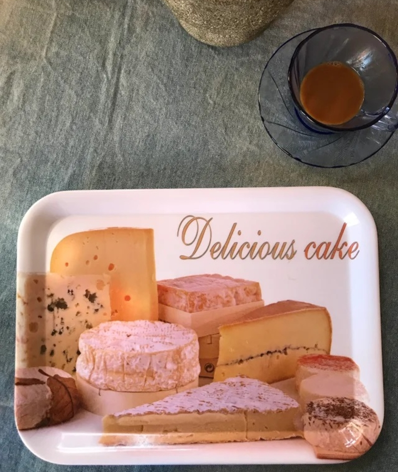
It's a lovely picture, though. Too bad they weren't actually advertising cheese.
Well Placed
Isn't it just marvelous when you realize your keyboard has an instant shutdown button placed right in the middle of it all, next to the 'Enter' button?
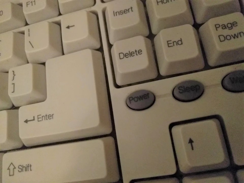
We don't even want to know how many mistakes have been caused by this obnoxious keyboard.
They Care...Just Not About Her Eyes
We're sure that was a lovely-looking nurse, who fits in perfectly with the kind-hearted nature of the ad. However, the geniuses in charge of design just screwed this up beautifully. Now, the nice-looking woman looks like an alien with extremely separated eyes.
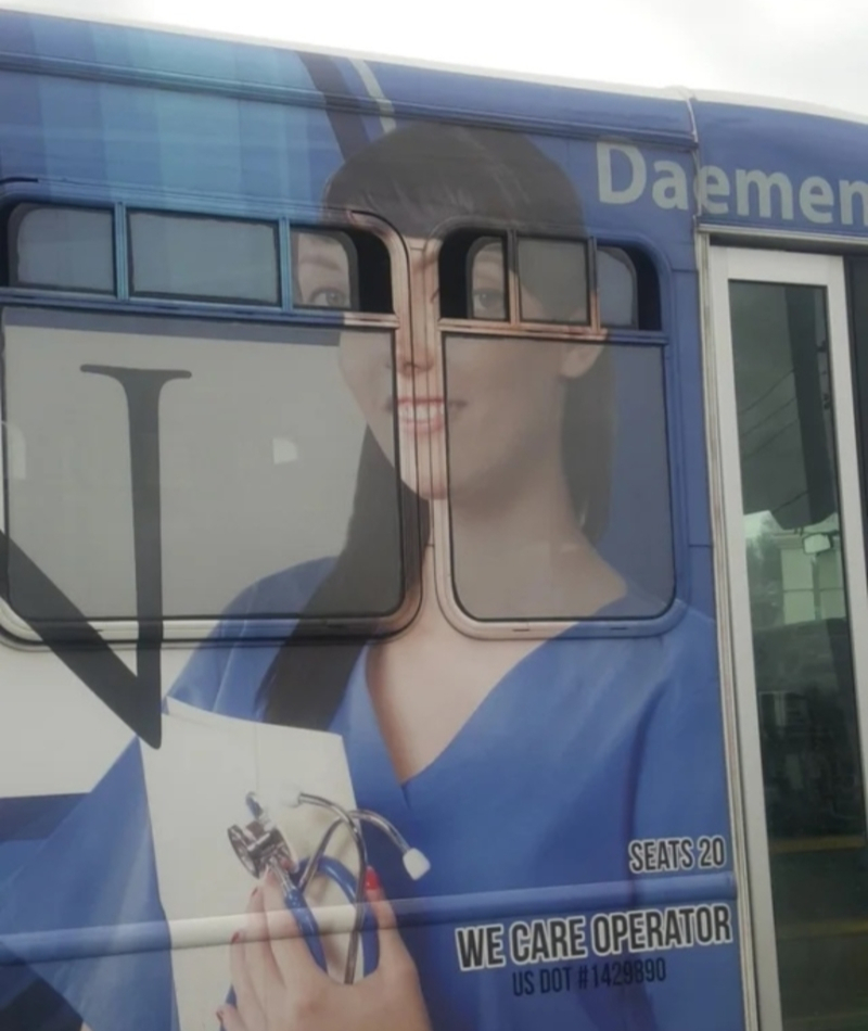
And we don't know about you, but that definitely wouldn't be our first choice next time we need to call a nurse.
The Existential Stairs
This looks like a movie set for Spike Jonze's 'Being John Malkovich. Honestly, there could be no other possible, or logical, explanation as to why somebody would do this.
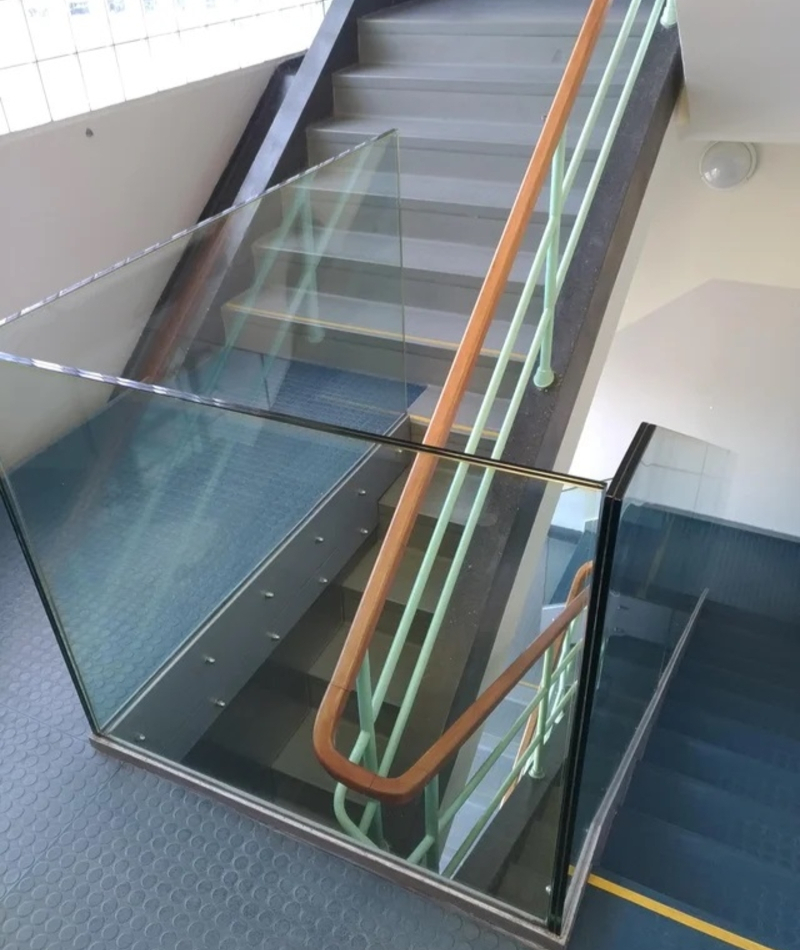
Unless the building owners were betting to see who had the first accident while using the stairs.
The Headless Schoolboy
Printing something on the side of a bus can be tricky - the proportions, the placing, the moving doors. However, this is why it's usually done by professionals. Because otherwise, this smiling child ends up looking like a decapitated schoolboy.

Whatever this ad was promoting, it's safe to say that sales won't see a significant increase this year.
Worst Phrasing Ever
Kruger & Matz have just won the prize for the worst phrasing and marketing failure ever.
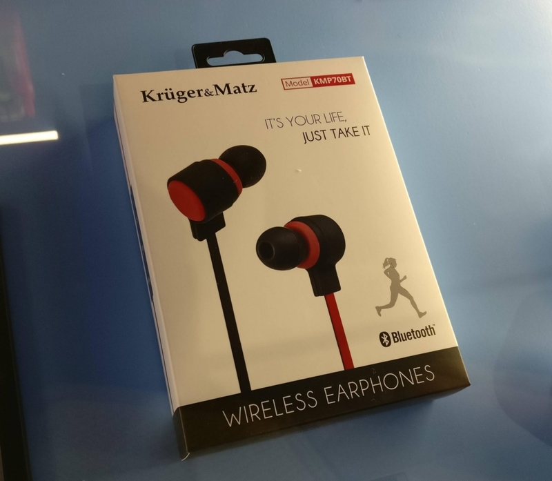
We understand that English is maybe not your first language, but if you're going to advertise something, make sure it doesn't have a double meaning! Especially one like that!
The Frisbee With Two Mouths
Not that kids, or whoever is using this Frisbee, would mind that the little smiley face on it isn't a Rembrandt. But, it should at least respect the basics of a face's anatomy, like a tongue coming out of a mouth, and not a nose.
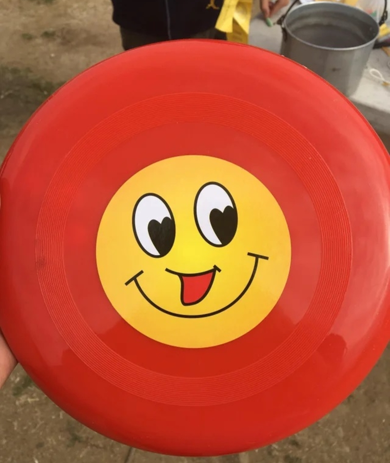
Maybe the toy company was feeling cheeky and decided to make their Frisbee smiley have two mouths because they're just cool like that.
The Optical Illusion Supermarket
This supermarket looks more like a carnival funhouse than a place to buy groceries. We're all for modern and groovy design, but this just makes us nauseous. And the supermarket is really not a place where you want to be sick.
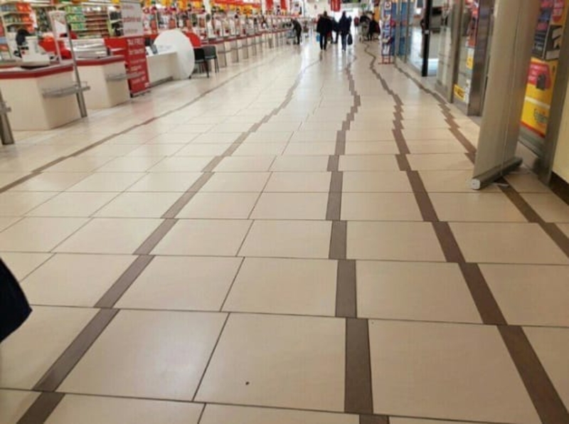
That being said, maybe the manager is very OCD, and can only stock aisle 4 when he steps on the brown lines. He's just making his life easier by design.
It's a Game
The guy looking for room 350 must've wasted 15 minutes just to figure out where he was going.
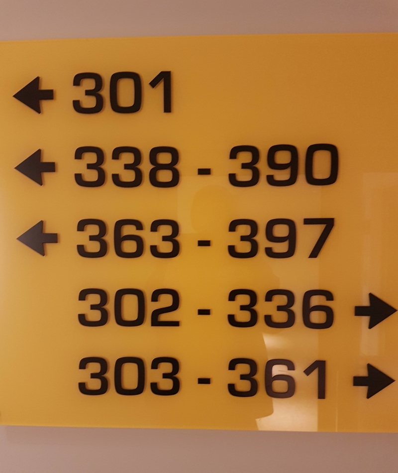
It makes us wonder, were the designers of this sign just having a bad day and decided they were just going to screw with everybody?
Come on, Disney
Really, Disney? That's where you decided to cut the sign?
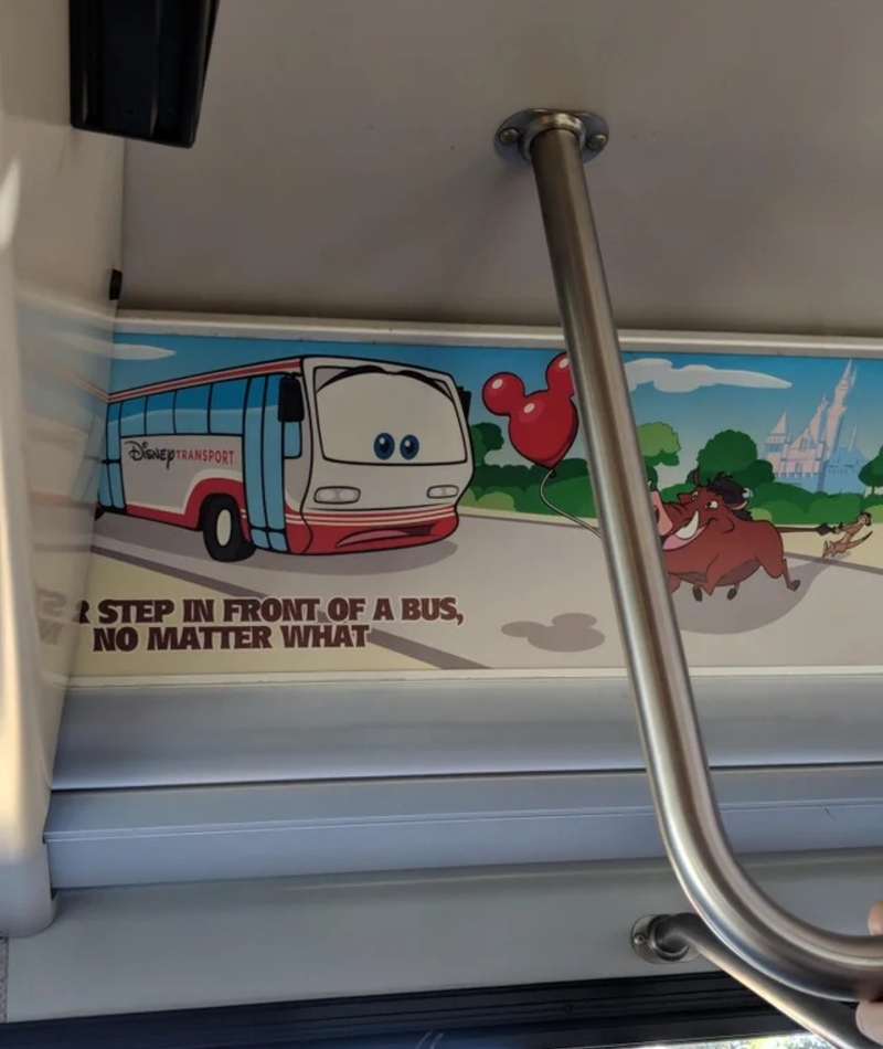
Thanks for trying to keep our kids safe, Disney. We really appreciate it.
The New Sliding Door
Either that company really isn't living up to its name, or they came out with a super cool new patent for a "push & pull" sliding door.
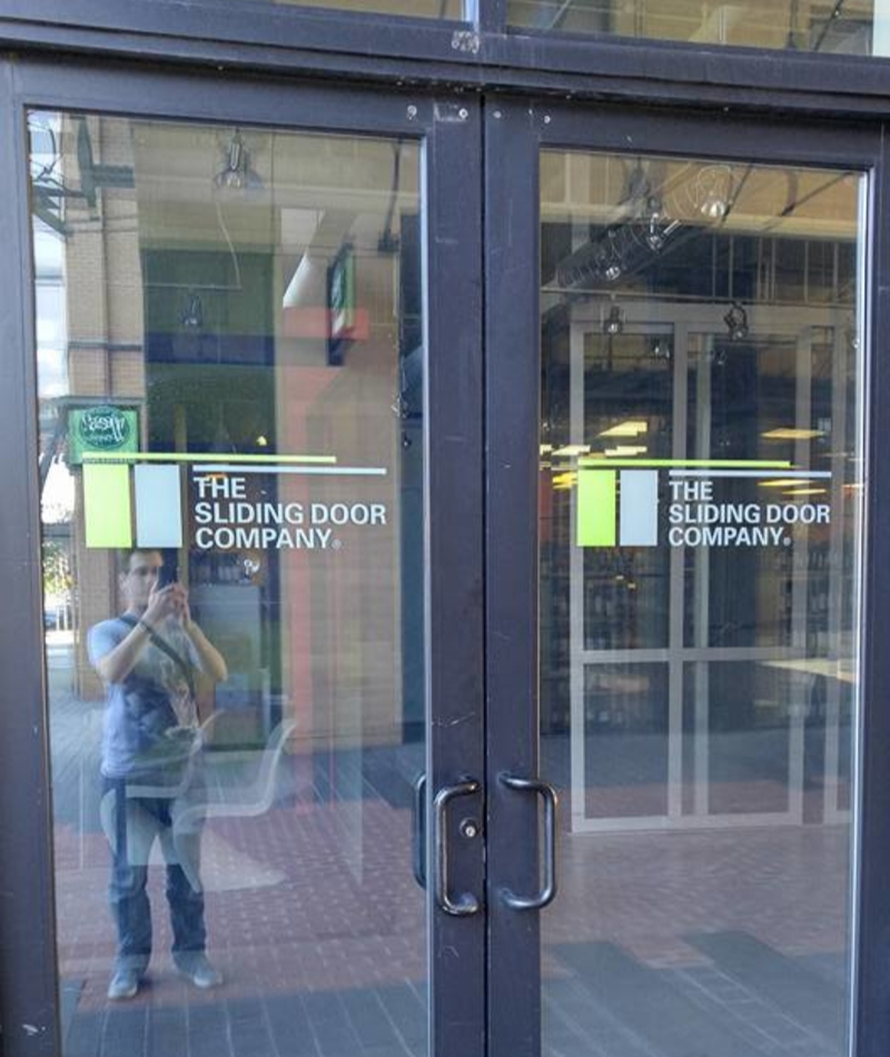
Regardless of what happened here, we don't think any businesses will be calling The Sliding Door Company for new installations any time soon.
Three is a Good Number
Whoever designed this sign should really pay more attention to phrasing. We get it, the speed limit is 20 mph because there are children on the road, but it could also be perfectly misconstrued as absolutely insane advice from parents that went a bit overboard when they decided to try and have siblings for little Jimmy to play with.
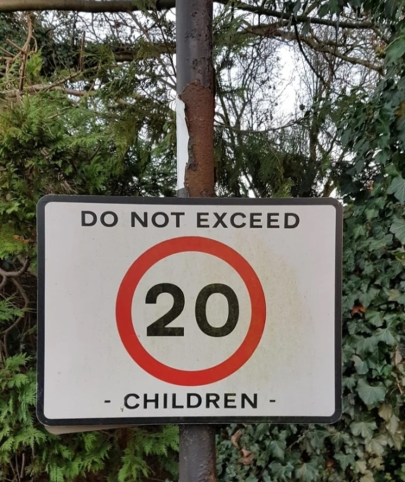
Do not exceed 20? We'd strongly recommend not having more than three! Unless you're rich and have 150 nannies.
Self-Serve Kiosks for Drunks
Unless the guys at Taco Bell had the 2 AM drunks in mind when they built these self-serve kiosks, we don't know what to think.
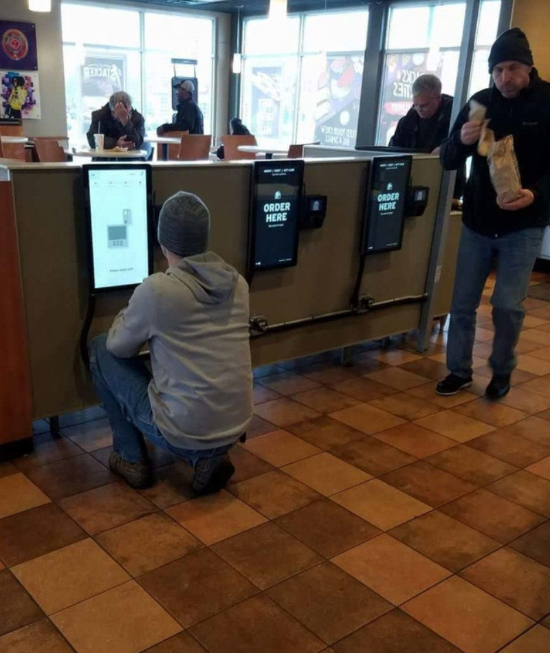
Sure, it's perfectly convenient when you're wasted and want to place your order while you're lying comatose on the floor, but if you're sober and taller than a five-year-old, this is extremely annoying.
Deceit at Its Worst
We get it - the real thing never looks like the picture on the box. But this is just too much. This arctic fox looks like he just got out of Chornobyl.
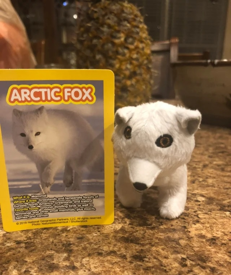
They could've at least placed the eyes in the right place!
No Words
This is so ridiculous we can't even find a title appropriate enough to describe this mess. We understand that there are many people out there who are under the impression that planning and building can be done by anybody. But folks, this is really not the case.
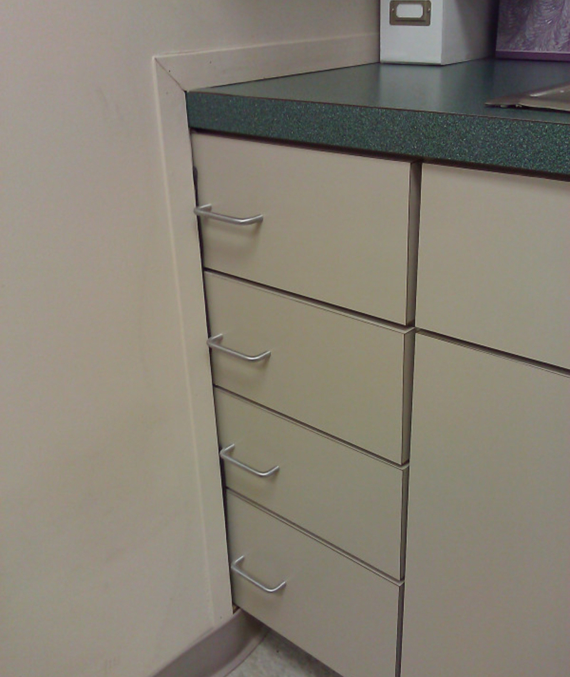
We can't even begin to understand how this happened. Maybe the person just did it on purpose and stored away all the things they never want to see again.
The Lost Island
We're sure the town hall had several meetings on whether to allow this little island to be built and after a long, tiring argument, they decided to go ahead and do it.
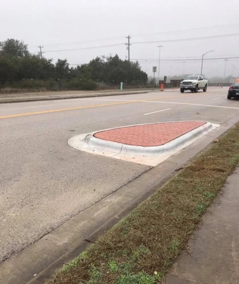
After all, what's a town without a completely useless, isolated, hazardous concrete island in the middle of the road? Now, this is teamwork at its best!
We'll Take His Word for It
Bravo to Dr. Sam Daher and his wonderful 14-month Invisalign treatment, giving teenagers hope that nobody will ever have to find out they're wearing braces again! However, Dr. Daher should've stayed away from marketing and flyer design.

For future reference, doctor, a "Before and After" photo only works if you can see the difference, which is clearly not the case since, for all we know, Brandon didn't have teeth in his"before" photo.
A Date With the Wall
We don't know what restaurant this is, or what the furniture designers were trying to do with that booth, but this is just hilarious. Then again, this teenager probably just wanted to sit down and eat already and couldn't find a proper spot, so, he saw a design fluke and made the best of it!

Although all things considered, the restaurant people should probably make better use of that area, since anybody sitting here, facing the wall, would just make any passersby want to cry!
Count Dracula, Your Sales Representative
Looks like Mr. Greenberg is much more than a sales representative. He's Count Dracula! No wonder he's number one.
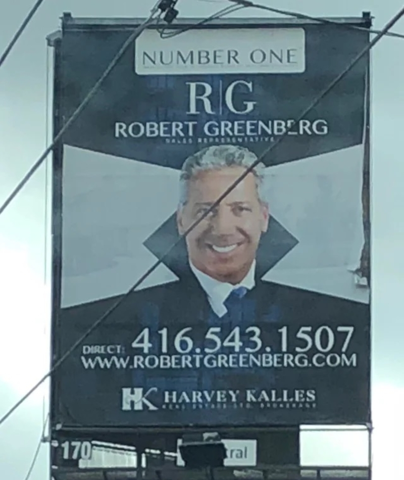
And to the design geniuses that decided to put a black tilted square behind a man's face to make it look like a vampire collar...thank you!
The Useless Bowl from the Future
We're all in favor of modern and futuristic-looking design, but this is just plain dumb. The worst part is, this happened at a restaurant, which means it wasn't the result of a drunken night at Pottery Barn. Someone actually paid for a set of these bowls!

Kudos to this customer though, because he seems to have worked out a system for the food to stay just under the holes.
The Abstract Cyclist
The funny (or very dangerous) thing about this sticker is that it gets worse the more you stare at it. We really hope this wasn't meant to be a safety or instructional drawing for how to ride a bicycle. First of all, the cyclist has no face.
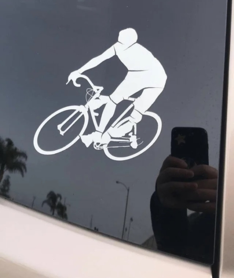
Secondly, he seems to be riding with both his legs on one side of the bike. And thirdly, how many feet does he actually have?! And where is he sitting? This is just wrong in so many ways.
Seems Legitimate
Companies wonder why people buying their products are often weary and distrustful. Well, here you have it, folks.

If these people couldn't even take the trouble to either stick something on that flag or on the 'Made in China' print, we don't even want to know what kind of quality control there was for the actual thing inside the box.
Endless Summer
While we appreciate the creativity behind these...shoes? we'd also like to point out that these are probably the tackiest fake feet we've ever seen. If you're feeling in a joking mood, by all means, grab a pair of these pink-toed "flip flops" and go for a walk...inside the house.
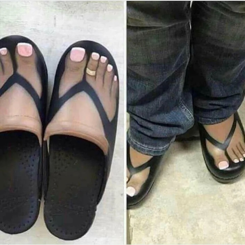
Otherwise, just keep walking if you ever happen to see these at a store. Sorry shoe designer, you won't be doing any internships at Jimmy Choo anytime soon.
Stick to Coffee
We love tea as much as anybody, but the person in charge of this design should've probably had a gallon or two of coffee before they stuck this design template on an actual wall.
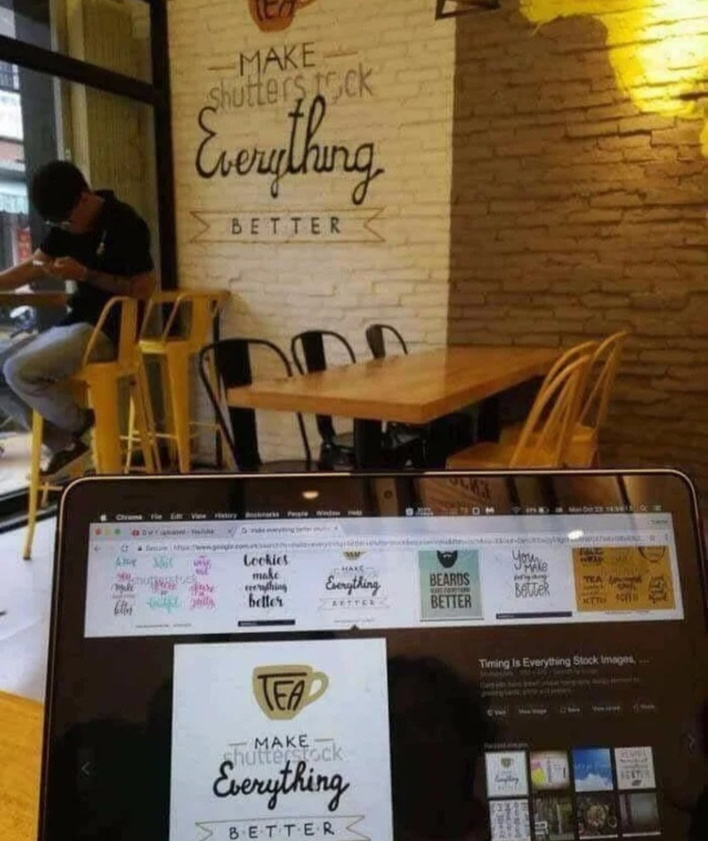
We understand how they could forget to erase the watermark from a screen. But not realizing it while plastering it on the wall?! Unless this is meant to be a joke, which to be honest, would kind of make the whole thing worse.
No Hands
While this glow-in-the-dark wall clock may have been a cool idea, in theory, something in the design is left to be desired. Oh, right, it’s that we need to see the hands to be able to tell what time it is.
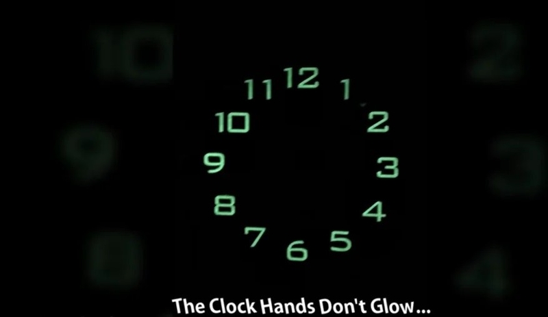
Oh well, they tried. Better luck next time!
I’ll Hold It
Would you or would you not be horrified to walk into a bathroom and see random, splotchy brown marks all over the walls? Usually, when that happens, it’s a cue to get out of there immediately and go find another restroom immediately.
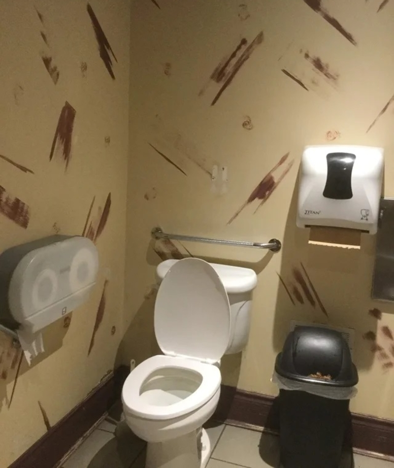
That’s a pretty poor choice in design for a room with a toilet in it. We wonder how many customers have run out of there, imagining the worst when they lay their eyes upon the color splatters.
Whose Hand Is That?
This photo is one of many that pop up when you search for something like “happy couple shopping,” on a stock photo website. At first glance, everything appears to be fairly typical – that is until you notice that creepy extra hand on her stomach.

Thankfully someone pieced together a sketch of what was likely happening outside of the frame. One that’s as hilariously creepy as the whole thing feels in the first place. Because if there was someone standing next to that couple with a hand on her stomach, it’s definitely creepy.
Knockoff
Whoever manufactured this bag had no idea what they were doing. They obviously wanted to create something to do with a popular franchise that people would want to buy – but they didn’t know which franchise, so they went with a few, only they couldn’t get those right, either.
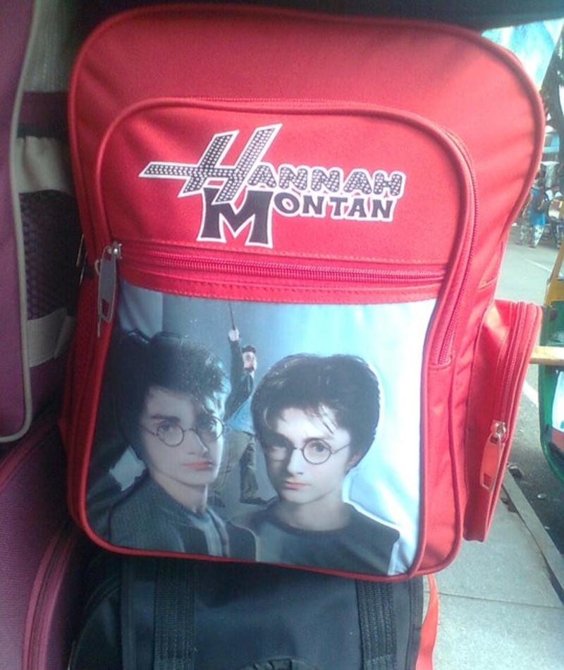
That’s pretty far from Hannah “Montan,” or her face. And speaking of face, why are there three of the same one, but not the right one?
Dirty Dishes
These plates would drive someone with OCD absolutely mad. Who designs dishware that looks like it’s covered in dirt and grime?
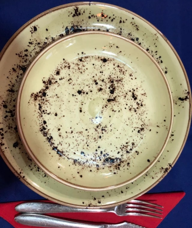
This company, apparently, that’s who. We can’t imagine that they sold too many sets of these things.
Try Anything Once
Even if you were raised to try new things, you may be a little iffy about this one – we know we would be. This is why it’s important to test your ads and make sure they look good (from all angles) before the public sees them. Then again, maybe it’s been bringing in even more business.
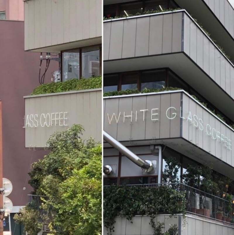
If not just to say, “you serve what now?”
Hammer Time Baby
Hey, always remember, if your baby is going to handle a hammer and nails, make sure they wear a hard hat. That way, if they’re going to hammer a plank to their thigh, at least their head will be protected. That sounds pretty ridiculous, doesn’t it? But apparently, they teach kids to build things before they can even talk.
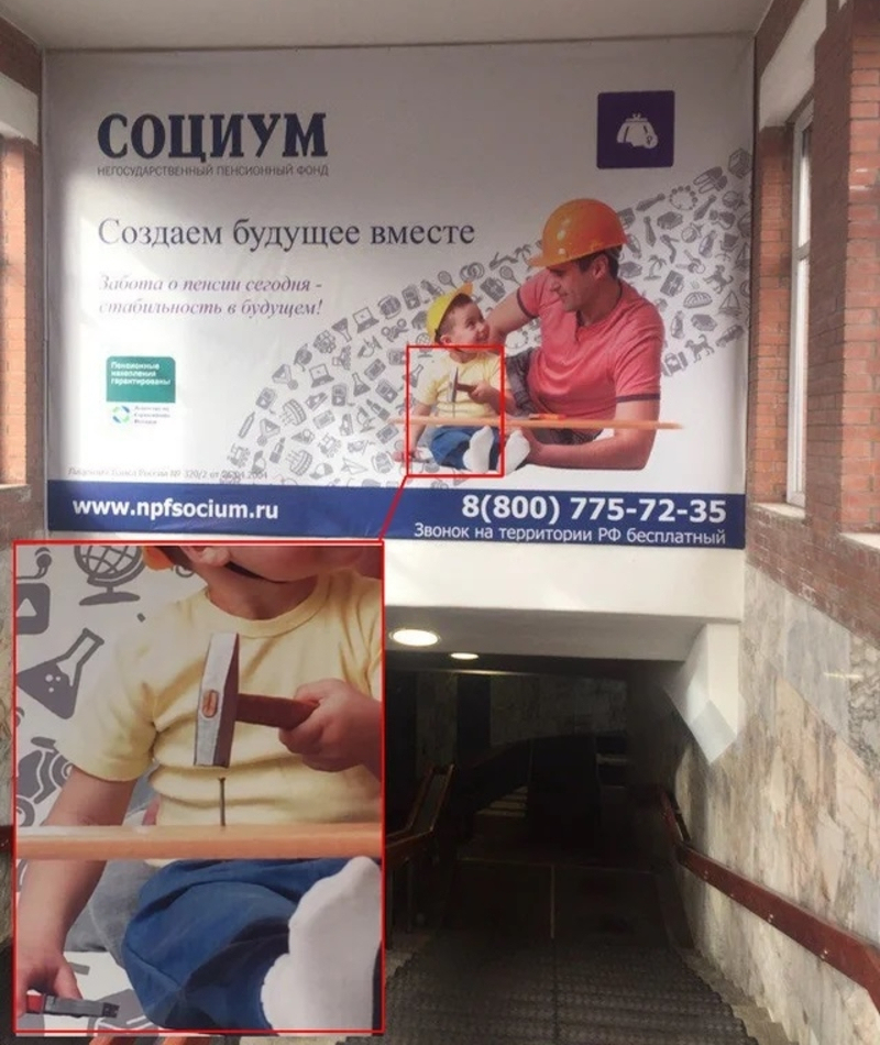
The whole supervision thing doesn’t seem to be working, either, since disaster is one strike away.
Coloration Station
You’d think that there would be quite a lengthy process in packaging bread and getting it all the way to the shelves. And yet none of the people at this company thought that using a green logo on their bread was a bad idea? Not only is it just one stamp on the front of the bag, either.

All it would have taken is a different color and they probably wouldn’t have scared off so many potential customers.
I…Maybe?
Since when the majority of people read something, we read it from left to right, and then top to bottom, this sign has it all wrong. They tried to make it legible by using different colors to separate the phrases, but it still just looks confusing.
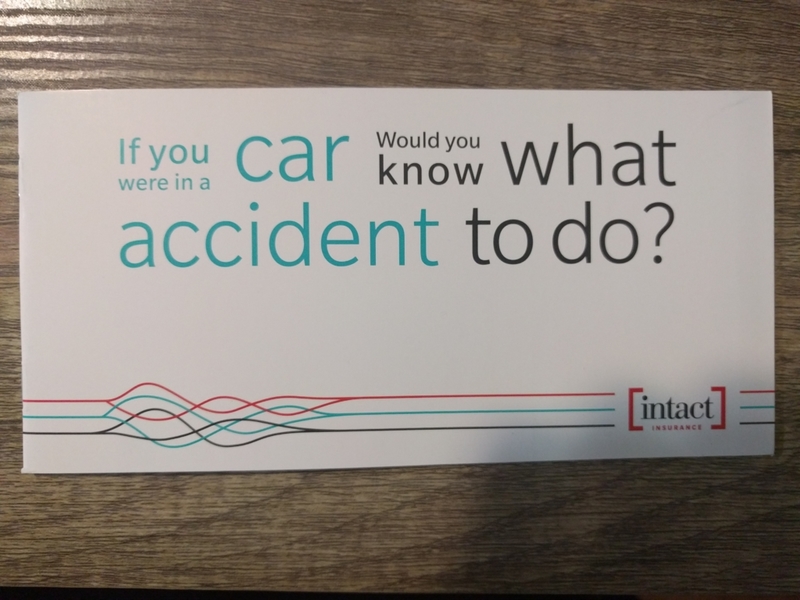
It’s even worse that it’s a sign talking about car accidents. This is the kind of thing that causes anxiety attacks.
Risky Business
We get that this company wanted to cut costs on the packaging, but they probably should have done something to differentiate these two packages. Say you’re just trying to take a nap and you wind up stuck on the toilet for three hours?
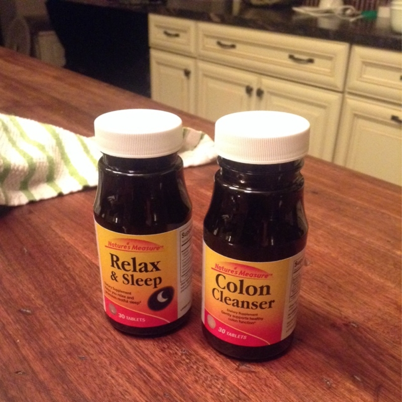
Or, you actually want to clean your colon and you just knock yourself out for eight hours in the middle of the day, instead? We’d use some red tape or something on one of them, just in case.
Waiting for a Lift
This guy is probably feeling a little left out on the joke – if that’s even what this was. It was either that or someone just really didn’t think about proper placement for this sign.
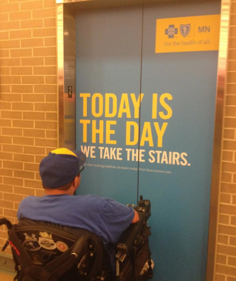
Maybe this should be a few feet over near the actual entrance to the stairs, instead.
Above All But Allison
Yes, we get what this sign was supposed to say. But Allison apparently wasn’t having any of it. It seems as though she went through a lot of trouble to pull this off.

If you asked her today, she’d probably tell you it was worth it just for these shots.
Fashion Faux Paw
Whoever designed this anti-animal cruelty hoodie made a pretty big flaw when they placed the writing on the back. Luckily this person noticed it before they took it for a spin in public – or maybe it was brought to their attention while they were out.
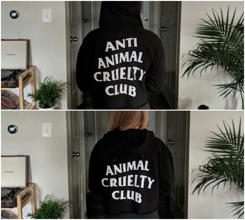
It would be pretty unsettling to see someone walking around (seemingly) promoting animal abuse!
Face-Sized Watch
When this company edited these photos for their ads, they must have been smoking, too. Why would they choose to add tiny hands next to the pictures of the watch? Then again, maybe they’re some type of novelty watch that’s supposed to be worn like a belt or something?
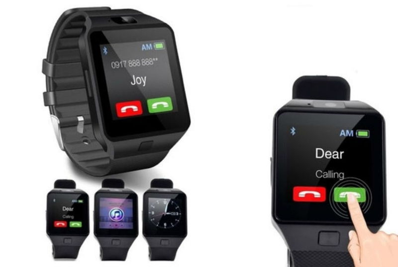
Some people do have a tough time reading a regular old wristwatch. Nope, it’s just a pair of really tiny hands photoshopped into the shot. Well, that or it’s a giant picture of the watch photoshopped in next to a regular-sized hand. How did no one notice this before the ad got printed?
Period Problems
Who were they trying to sell this skirt to? A man would probably have a panic attack if he saw some woman standing next to him in this thing. And most women probably aren’t into rocking the whole “that time of the month came early while I’m in a white skirt with zero preparation,” look.
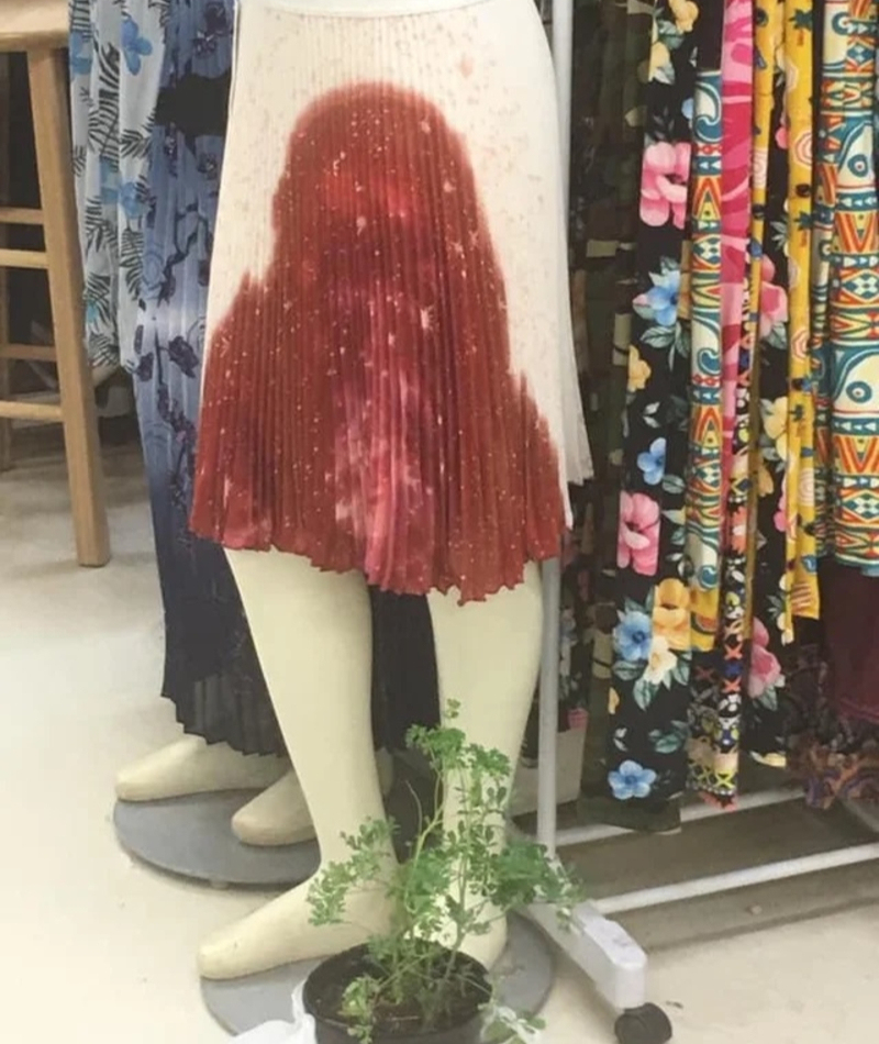
It could, however, make a great prop for teaching health classes to middle schoolers.
Hippo-Pottymas
There’s no way this wasn’t done intentionally, right? How could no one say, “no, man, it looks like the hippo is shooting those balls out of his…” Right?
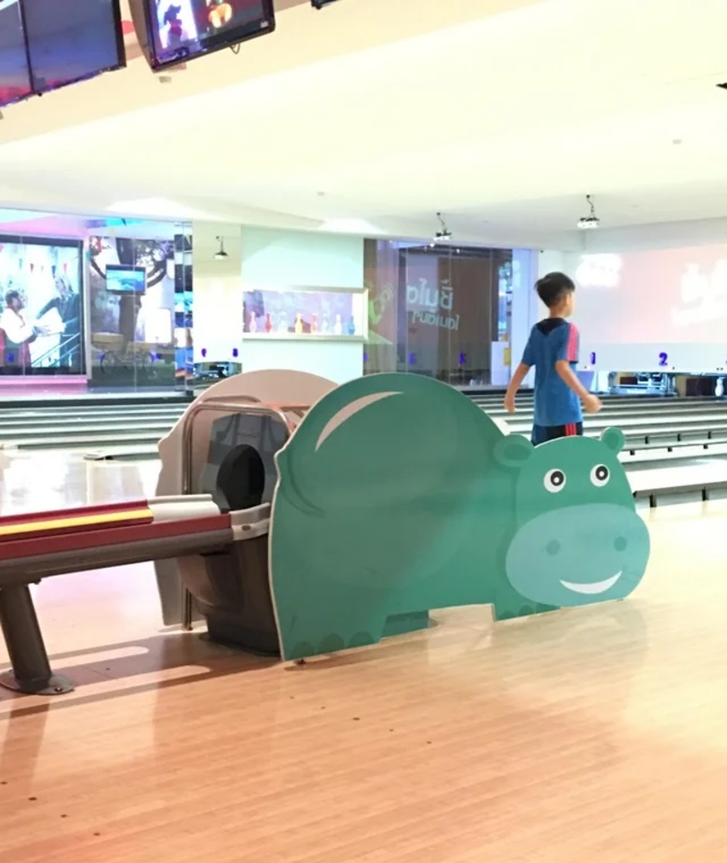
Then again, kids probably find it to be hilarious (and probably some adults, too.)
Out of Order
This is a case of someone not thinking about how people read from left to right and then top-to-bottom. So, it seems as though this signage says “SASA LELE,” whatever that may be. Luckily, it looks easy enough to rearrange the letters. Hopefully, the manager realized that was the issue when that sale wasn’t bringing in any customers.
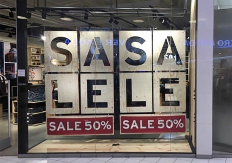
Or, maybe it was the manager who put it up in the first place?
Baby-Building Factory
This bus quite obviously belongs to some kind of robot baby-making facility. Or at least, that’s what the whole cyborg eye thing that the little girl has going on makes it look like. And, according to Futurism.com, those things actually exist now.
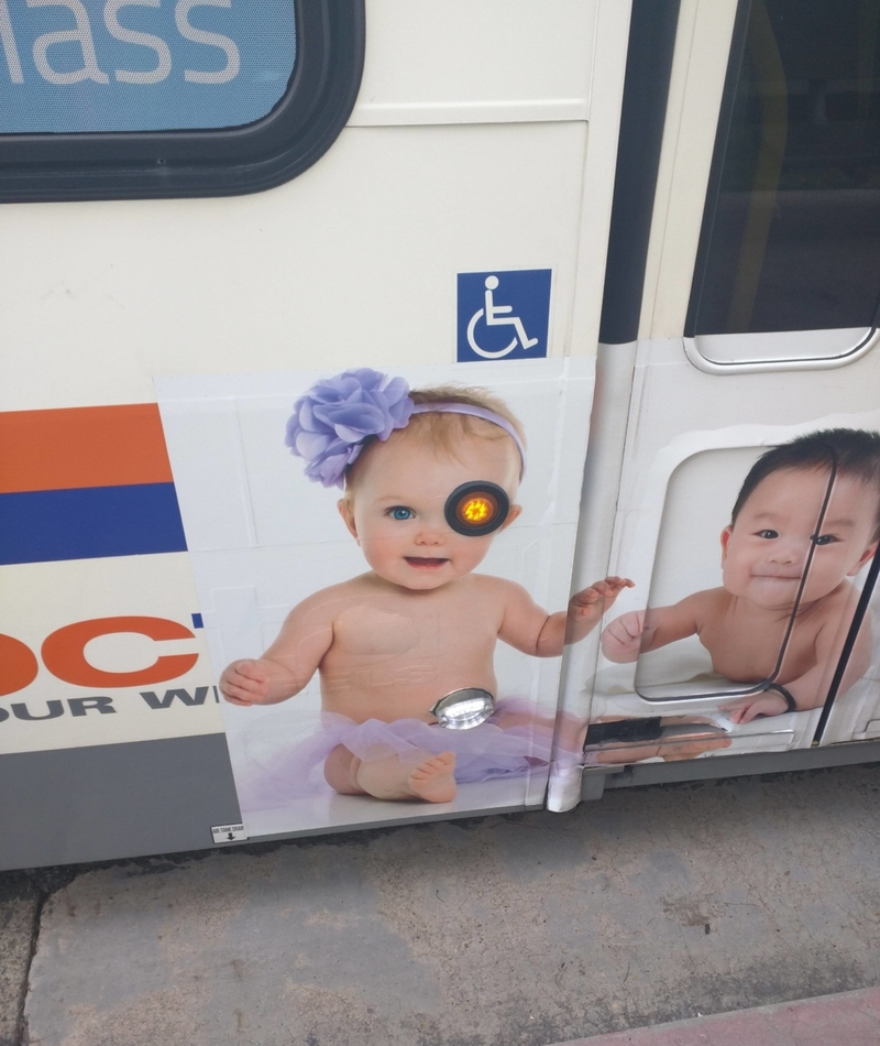
One filmmaker in Canada named Rob Spence replaced his missing eye with a little video camera. It may not be able to kill you, but it’s still pretty high-tech.
Nightmare Potatoes
Way to make us associate one of our favorite vegetables with this terrifying…whatever it is we’re looking at. If you’re going to make a potato character to sell your product, at least make it friendly-looking!
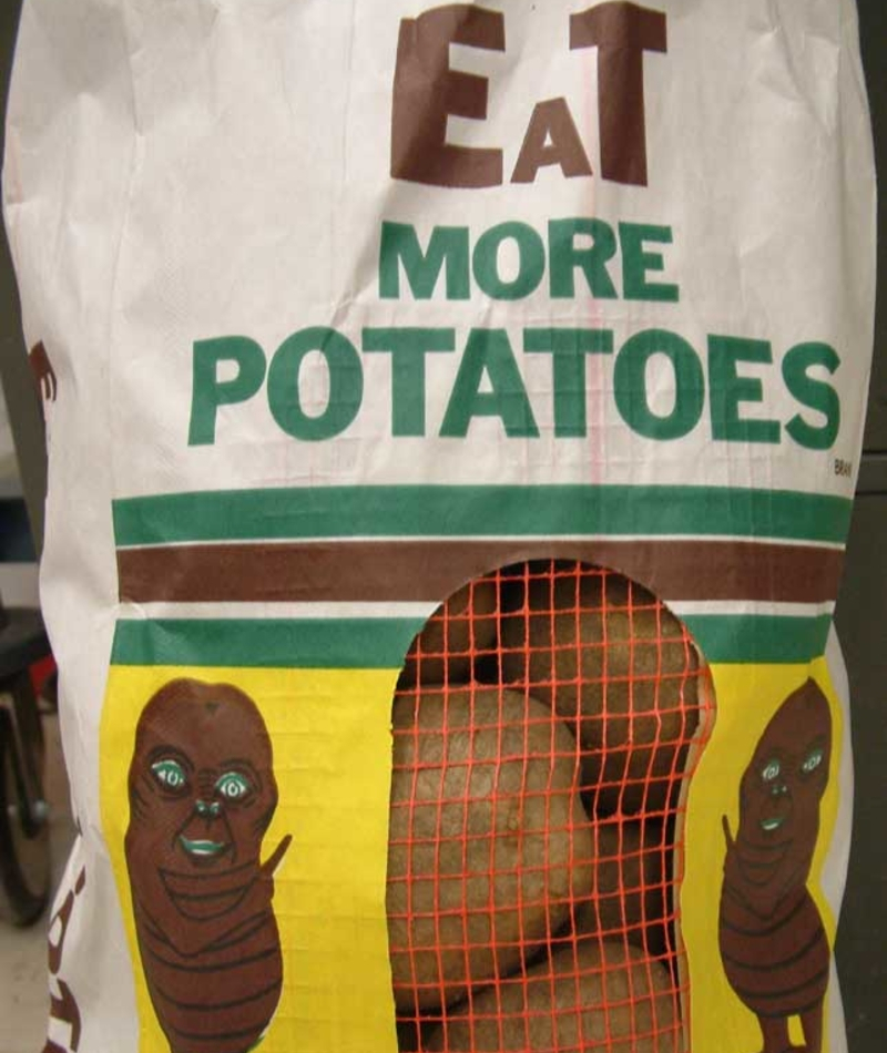
This thing just makes us want to toss this bag and run in the opposite direction.
Keep Walking, Kids
This outdoor sitting area looks like a Lady Gaga music video set. All it needs is for her to come out in her infamous meat dress and it will all fall into place. It may not be meat – but it definitely looks like it.

But hey, if you love steak, you’d probably have to stop and snap a picture on your way through.
A Special Kind of Classroom
Okay, we’re not sure if this is technically a classroom, but it certainly seems like it’s set up as such. Why is there no door or wall blocking this bathroom from the rows of chairs facing it? Also, why does the toilet paper look as if it’s way too far away from the seat?
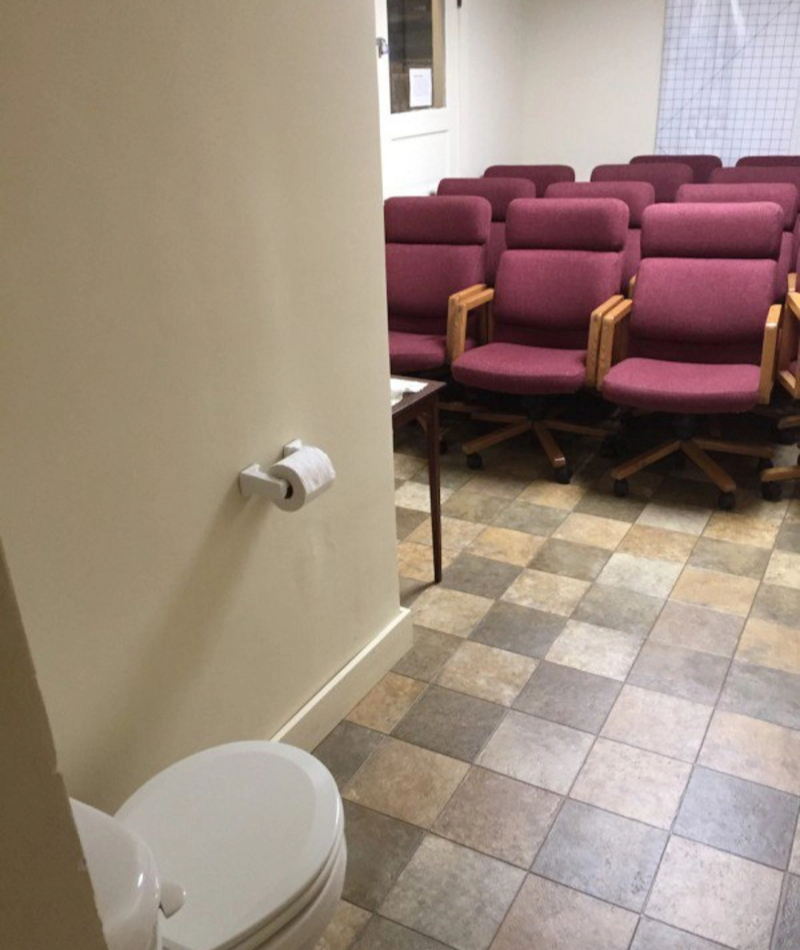
Perhaps this is some odd type of health class setting where they require the toilet for some kind of demonstration? For the sake of whoever has to sit in any of those chairs, we hope not.
(Wrongly) Stating the Obvious
Google is the most popular website in the world, and basically, everyone knows of its existence. So, it’s baffling as to why they say they “couldn’t connect to translator service,” when all it takes is a few clicks and typing your message into Google Translator to convert any phrase to and from any language in the world.

You’re telling us no one at that company knows about Google? Hopefully, some kind-hearted tourists helped them out by pointing out the error!
What’s Going on Here?
Can you imagine coming back into your hotel after a night out drinking on vacation and seeing this? It’d probably be pretty tough to get back up to your room when the floors are all jumbled up. Maybe they should have someone who knows how to count and repaint the buttons.
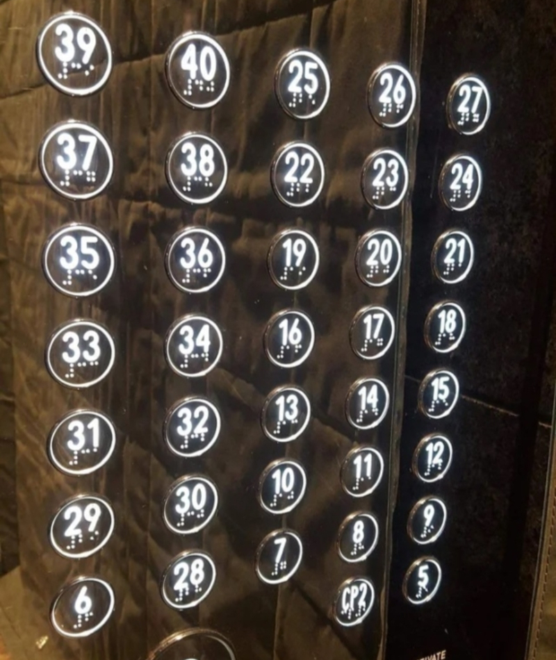
Seriously. Why is six all the way down trapped between a mixed up 28,29, and 30? And that’s just one of basically all of the number placements that make no sense!
Can’t Get Through
Although it may seem as though someone's bag is covering the ad's phone number, that’s not the case. Nope, this company has in fact painted that orange backpack right over the last few digits of their number. This is definitely a marketing fail, one that had to at least have gone through a couple of people to make it to the bench.
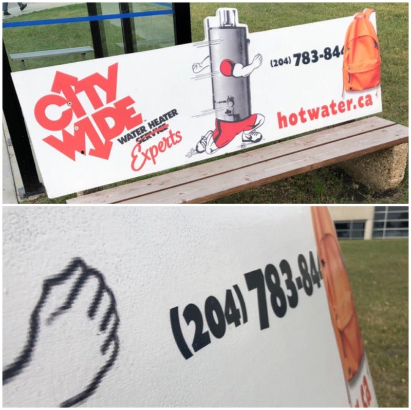
How do you expect to get business if no one knows how to get a hold of you in the first place? The bag also makes zero sense in the context of the ad, anyway.
Why Punctuation is Important
This is another case of someone who was either too lazy to use some simple punctuation marks or wasn’t entirely sure how to go about it. They could have laid out a few different ways to differentiate between the lines.
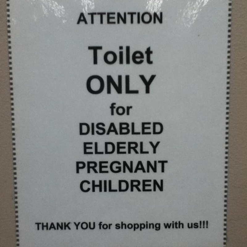
But, since they didn’t, it seems like that restroom is designated only for the disabled elderly, and pregnant children. Next time use a couple of commas or bullet points!
Murder Scene
When you first look at this picture, it looks like an image that was pulled from a police crime scene investigation, or maybe a horror movie. But even though it looks like someone was stabbed to death on the bed, believe it or not, that red stuff is actually roses.
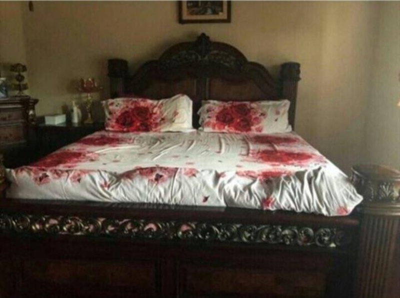
If this guy (or girl) was trying to be romantic, he or she failed miserably. It does make for a great story to tell in their future, though!
A Beautiful 'Morriage'
Unless this couple is planning to name their child “Boby, it's clear that somebody didn’t quite think this one all the way through. While the ring may look similar to a lowercase “a,” it’s missing the top extension, so it just looks like an “o,” instead.

But then, they knew that deep down, because they used it as the “o,” in love. Hey, it’s the thought that counts, right?
Turn Off the Lights
The idea behind this pillow is that, if you and your long-distance partner each have one, when one of you is sleeping on it, both units will light up. This may be cute for watching Netflix and holding onto your pillow while you’re missing them – but for sleeping?
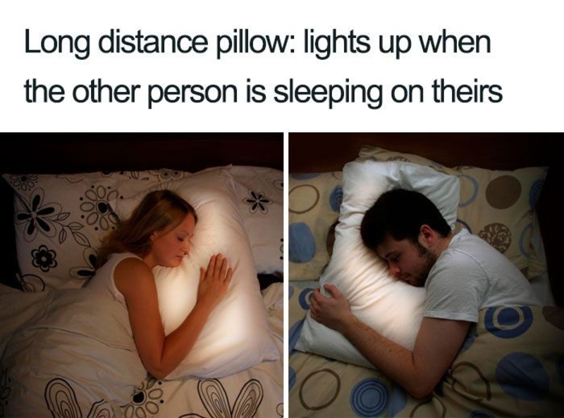
Not so much. Well, not unless you both enjoy sleeping with bright lights in your face. Whoever designed this thing sure must. Otherwise, how did no one catch that?
No Thank You, Sir
The font choice on this work uniform may end up getting these delivery people arrested (or hit on,) depending on where it is that they are! Alternatively, if they happened to stroll through the right crowd, maybe they’d get a different type of reaction. But it’s probably best not to take any chances, and just redo the tops, instead.

Did no one check to make sure they looked okay before they were used? Yikes! We wonder how many people want whatever this company is selling.
Moving On
We’d keep it going right onto the next stall if we had to pee in this bathroom. That just looks so…raunchy.
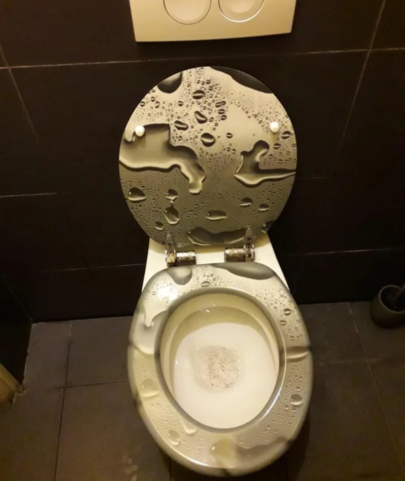
Who thought that was a good idea? Gross.
Mirrored Signs
Apparently, this company meant to say “mirror” and not "window." Or, they did mean to and just completely forgot about how the world works for the time it took to slap this thing on. That doesn’t seem like a very solid advertising campaign for a company that claims they put these on professionally.
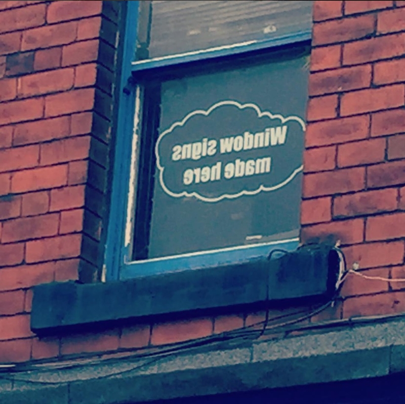
Maybe they just opened? Hopefully, they’ve got it down at this point.
Dirty Countertops
If you were a guest in this person’s home and went to use the restroom after dinner, you may get a little sick at this sight. Why anyone chooses to use brown smears for any type of design in their bathroom is super questionable.

A germaphobe would take off running, never look back, and write a terrible review on Yelp. This is also another perfect example of one of the many reasons why carrying hand sanitizer with you is never a bad idea.
Not-so-Custom Customized Pillow
Apparently, the person who ordered this throw pillow online had no idea what they were actually buying. Either that or they missed the box where they were supposed to erase “sample text,” and type their own message.
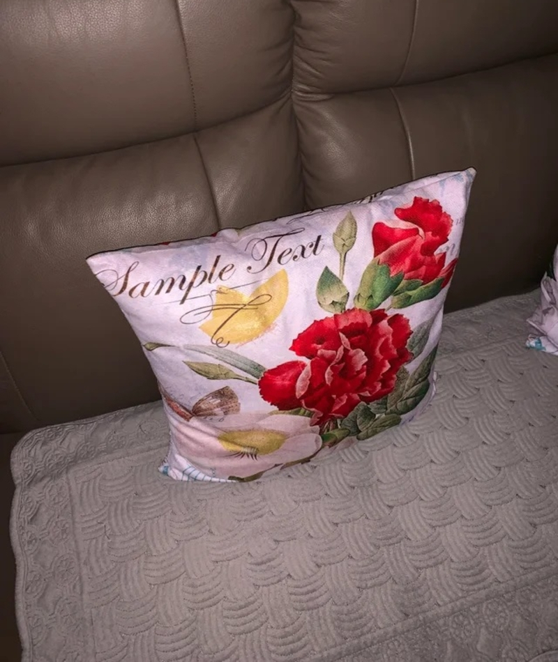
Missed opportunity? Yes. Hilarious mistake? Also, yes.
Missing Something
This would be a great gag souvenir for your friend or kid. That’s because it’s definitely memorable, even if it’s not for the greatest of reasons. Why on earth wouldn’t they have used the tower for the “a,” which would actually make a little sense, depending on the typography?
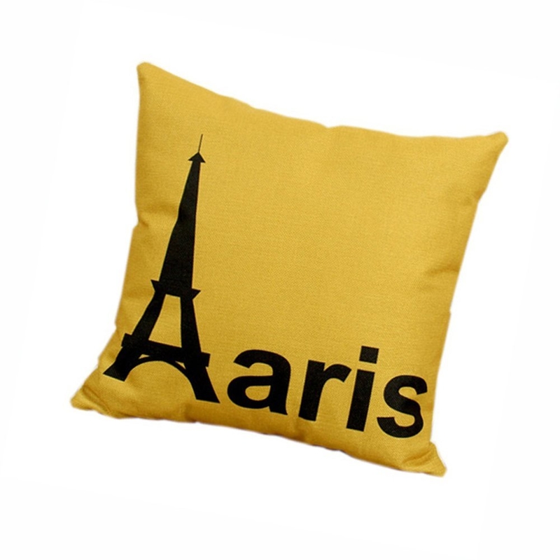
And, unless is the lighting, that color is also pretty terrible on its own, even without the lettering issue.
Bad Idea
Although this company may have the best of intentions in alerting drivers of the dangers of taking their eyes off the road for too long, it seems like using this long paragraph to do so is counterproductive. Texting and driving is a big no-no, so reading things like this falls into that category, too.
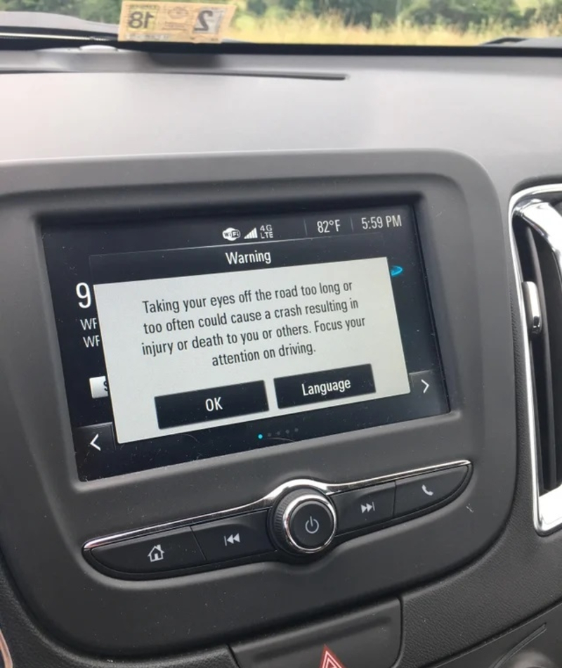
Hopefully, they’ve updated that feature and fixed the issue! This one may be somewhat funny, but it could also be dangerous for both the person driving the car and everyone else on the road with them!
We Got it The First Time, Anna
Perhaps it was the blind onion next door that put together Anna’s sign. It sure seems like they went a little overboard with the whole “food mart,” thing, doesn’t it?

Okay, we get it, you’re a food mart. Geez. Wouldn’t the large print be sufficient enough to tell us that, though? The smaller words in the middle and at the bottom of the sign aren’t helpful. If anything, they’re just confusing. Did Anna really think this sign was a good idea?
You Had One Job
When drains are placed around streets, they are typically done so at a level that ensures they collect the rainwater like they’re supposed to do.
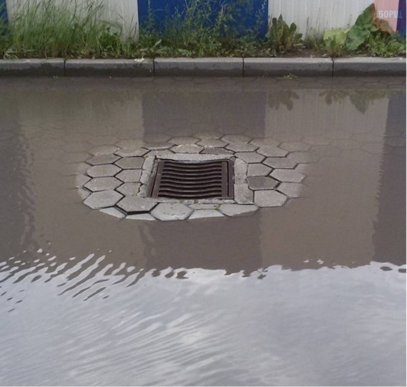
Unfortunately, this crew didn’t get the memo. Now, this drain is more for show than anything else.
Do What Now?
This road sign could lead to some serious traffic trouble, considering it can’t make up its mind about what it wants from the cars passing by. The right lane MUST right-left, okay? Let’s hope that makes more sense to the people in the area than it does to us.
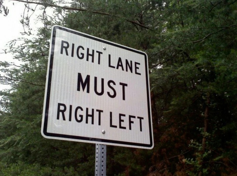
Are we supposed to stay right or go left? Hopefully, that’s not standing in a very congested part of town! Someone could actually get hurt by this person’s mistake. Fingers crossed that they’ve fixed it since this picture was taken.
That Face
If you just happened to be cruising home from work one day and randomly saw this giant face looking down at you from a billboard, what would you think? You’d probably wonder what on earth the sign was for. But either that was the point or this guy just didn’t care, because here we are (and there…he is.)
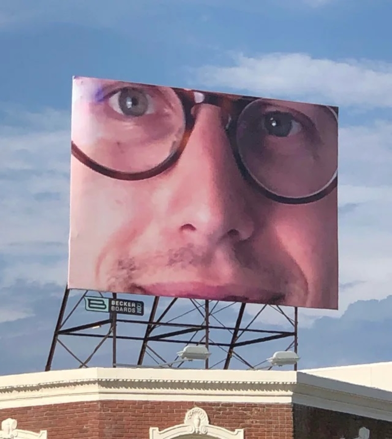
Maybe this guy ordered his billboard space through that app, Blip, or something similar. It allows anyone that has the money to spend to order the space. All you do is set a daily budget and choose whether you want your message to play during “peak times” or not – peak times likely meaning both rush hours and stuff like that. We wonder how much this guy paid to confuse everyone driving past this sign and make them feel a little uncomfortable.